CLS at BuzzFeed — Part 1: Raising The Floor
This article is part of a three-part series documenting how BuzzFeed tackled their issues with Cumulative Layout Shift as part of a broader Web Vitals initiative. Take a look at parts two and three.
Google launched thousands of performance teams across the globe when they announced they’d be factoring Core Web Vitals into Page Rank. BuzzFeed was no exception. We’ve always cared about web performance but we’d taken our eye off the ball and we had a lot of work to do to catch up with these new requirements.
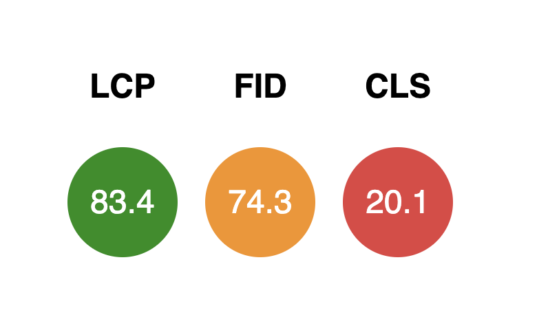
Our Largest Contentful Paint (LCP) scores were fine, as were First Input Delay (FID) which was a relief given we load React on the page and often hear how that can prevent you from reaching these targets. Where we felt catastrophically short of the mark was Cumulative Layout Shift (CLS) where only 20% of visits were receiving a “good” experience — a long way from the 75% target.
This blog post, and the subsequent parts, detail the progress we’ve made and the lessons we’ve learned which can help your team accomplish the same improvements.

- Reliance on digital advertising — delayed load and unpredictable sizing
- A large amount of third party code
- A high degree of page variability (based on page layout, content, content types, embeds)
- Lots of unique pages (in the millions)
To address the issue it was clear we had to improve our observability over the current state as well as drastically simplify the problem space.
Improving our Observability over CLS
Real User Monitoring

We now could monitor the impact of our changes over time and at a much faster cadence than CrUX. Owning our own data would also prove extremely useful later in the process (which we’ll get to) by allowing us to drill down into results by date, page type, and even the specific embeds that are loaded into each page.
Synthetic Monitoring
Synthetic monitoring provides a consistent testing environment for us to repeatedly run the same tests and track results over time. We use Calibre to provide the testing environment and tests are run a few times a day.
Whilst this gave us a consistent environment to test from, we didn’t have a consistent and predictable test subject due to the variability of our pages (different ads could be loaded, AB tests running, new features released, etc.). If we suddenly ran a new ad campaign, one that uses a different ad height or one with heavier assets, it could very easily balloon our scores and set off alerts.
To create a predictable test subject we came up with the concept of breaking our pages into independently testable layers:
- Content Layer — we load everything required to show just the page content. This includes interactive embeds and quizzes but doesn’t include complimentary units.
- Feature Layer — everything above plus complimentary units such as recirculation feeds, comments, polls.
- Full Render Layer — everything above plus ads (configured to be consistent each time)
An illustrated example of applying the layers concept to our article pages:



Next, we loaded a representative amount of test pages into Calibre. Our RUM data is imported into BigQuery so we were able to find 10 pages from the “good” range, 10 pages that “needed improvement” and 20 “poor” pages.

Finding and Fixing Issues
Synthetic monitoring was great for narrowing in on units that were causing issues. We took a very deliberate, data-driven approach to prioritizing them — biasing for units and page types that received high volumes of page views. This is one of the lessons we’ve learned over the years of managing performance on a site as big as BuzzFeed — we’ll never complete the full list of possible performance optimizations so we need to ruthlessly focus on the ROI of each change using real data.
Once we’d identified the unit to fix we switched to Chrome Dev Tools and Lighthouse to work more closely and make the required changes. Many articles explain how to do this already (here’s one) so this post won’t try to cover them.
These were our most successful early improvements to CLS:
Correct Image Sizing
Adding width/height attributes to all images was a fairly easy and high-impact win. Originally we were just prioritizing the above-the-fold images but eventually pivoted to include all images on the page.
Static Placeholders for Ads
Most of our ad units can change dimensions depending on the ad inventory that’s actually served. We used our ad impression data to choose the most common ad size for each unit and created static placeholders for them. We also reversed a previous decision to collapse ads when there was no inventory to serve.
Static placeholders for embedded content (e.g. TikTok, Reddit, Twitter)
Unlike ads, where we at least had a range of sizes to choose from, embeds have no fixed dimensions and were impossible for us to accurately size. For example, a Twitter embed can vary dramatically in height depending on the content of the tweet and whether it contains images or videos.
We took the approach of best-guess-sizing them and trying to minimize the CLS impact rather than eliminate it altogether, as we assumed it was impossible to do better. Part 3 of this series will detail how we challenged and got past this assumption.
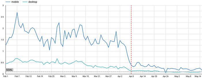
Despite our best-guess sizing being imperfect, it still had a considerable impact on posts with a large number of embeds. The graphs below show daily CLS scores based on the 75th percentile of page views. The red line denotes when these updates were released.

A note on “Below the Fold”
Until recently, we had not found a good solution for measuring this consistently — either on an ad hoc basis or via synthetic tests. Our method for measuring and diagnosing issues on scroll was to use Chrome dev tools and record via the performance tab as we manually scrolled. In the future, we may use Lighthouse User Flows to automate this. We’d be interested to hear what solutions others have found!
When RUM disagrees with Synthetic
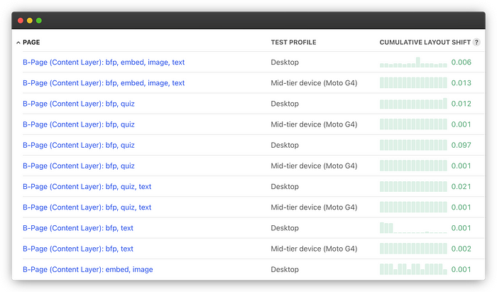
Over a few months, we applied the above fixes and many more; one by one we found and fixed issues until our synthetic tests in Calibre were hitting the mark. It was extremely satisfying to scroll down the list of 240 pages with a sea of Green text reflecting the progress we’d made. The problem was… it wasn’t reflected in our RUM data or in the eyes of Google: we were still far below the 75% mark.
Green results all the way according to Calibre:
CrUX Data still shows only ~50% of users are receiving a “good” experience:
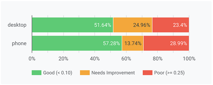
At this point, we were running out of ideas. Our list of obvious issues to fix was now complete and, whilst we were closer, our goal still felt fairly far from reach. We’d markedly improved the experience and raised the floor across all of our pages but we were going to need a breakthrough to move that green bar closer to 75%.
This is when we turned to our users for help. We’ll cover that in Part 2.
This article was co-authored with Ian Feather. Many thanks to Maria Enderton for her contributions.
BuzzFeed Tech is hiring! 👋
If you are interested in browsing openings, check out buzzfeed.com/jobs. We have roles based in Los Angeles, Minneapolis, London, and New York with options for remote work!


