CLS at BuzzFeed — Part 2: Getting Help From Real Users
This article is part of a three-part series documenting how BuzzFeed tackled their issues with Cumulative Layout Shift as part of a broader Web Vitals initiative. Take a look at parts one and three.
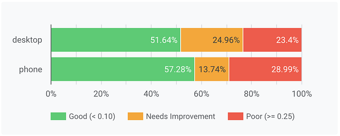
In Part 1 of this series we detailed our initial approach to reducing our Cumulative Layout Shift scores and reached the stage where our synthetic tests were all passing yet our Real User Monitoring (RUM) data showed only ~50% of users were getting a “good” experience.


At this point, we’d fixed all the obvious issues and exhausted our ideas for which parts of the site to next investigate. It was clear we needed to find a new way of identifying the problematic elements. After reading the web.dev article, Debug Web Vitals in the field, we realized we could lean on the vast BuzzFeed audience, our analytics pipeline, and the Layout Instability API to provide us with direction.
Adding Elements to the Analytics Pipeline
We have a robust, in-house analytics pipeline at BuzzFeed that we use to also send RUM data. The data travels through various filters and enrichment layers before being stored in BigQuery where we can run analyses or export the data to tools like Looker and DataStudio.

We updated our performance library to start sending back events containing the DOM elements incurring the largest layout shifts. Each event included the CSS Selector for the DOM node, along with its CLS score.
Once deployed, we were able to run queries and start understanding what our users were actually seeing, often finding it to be quite different from the experience of our synthetic tools.
This wasn’t without its challenges. There was a tremendous amount of noise in the data, the CSS selectors were often unwieldy, and the element that was being shifted wasn’t always the element that actually caused the shift. We were also getting a huge number of events reporting extremely low scores that we wanted to ignore.
It was still possible to use the data via one-off queries but we wanted to create a dashboard that all teams could easily use and which would give them unambiguous direction on what to fix.
In the end, we found that a simple Impact metric (volume * CLS score) was sufficient to cut out a lot of the noise. When we connected this query to Data Studio it was immediately clear if there were outlier elements that were disproportionately affecting CLS. This dashboard is now part of the suite of tools that teams at BuzzFeed lean on for managing the performance of their pages.

What the data exposed
This new visibility showed us a few key things:
- Our banner ads were by far the biggest culprit due to their ability to increase in size from 120px to 240px. This was something we had no plans on changing but it was still useful to have the data to bring to a conversation.
- The majority of reported issues were below the fold and out of sight of most synthetic testing tools.
- There were areas of our pages that we had forgotten were shown to users and which we’d never have found with manual testing.
The last point was the most fruitful. A good example of this is we include the Branch SDK on our site to display app install banners to first-time viewers and viewers who have reached a high engagement point of a user journey. This is something engineers rarely saw because they had dismissed the banner long ago.
Engineers could create the conditions to replicate this experience locally, and then see the issue in Lighthouse, but it just wasn’t something we were even considering. Without this new data, we could very easily never have investigated this banner. With that data, we were able to quickly identify units that needed attention.
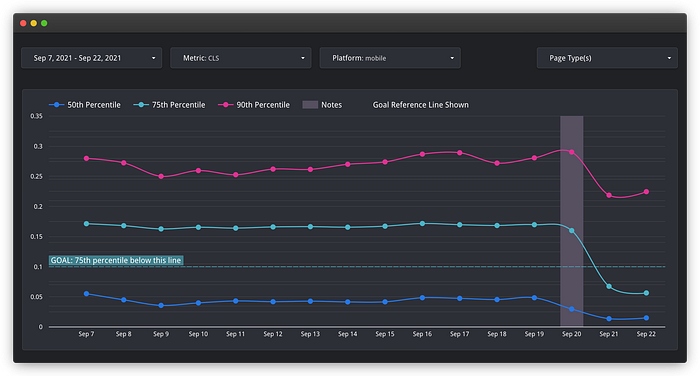
It turns out the branch banner itself was causing an average CLS impact of 0.17, pushing the page over the limit even before loading anything else, and with our tooling, we were able to see that fixing the branch banner was by far this most impactful change we could make to reduce the CLS impact.

This specific solution turned out to be “this one weird trick”. The banner was being placed at the bottom of the screen using position: fixed. Switching to position: sticky completely removed the layout shift. This diff in the Chromium source code does confirm that sticky-positioned objects would have no impact on CLS. It remains unclear (based on some of the reported issues) how we should expect fixed-positioned objects to behave.
The graph below shows the impact of fixing the Branch issue on Tasty.co: the update pushed the score past the goal for all mobile page views.

Results
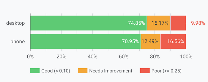
By using this approach and applying fixes to the most serious issues, we were able to improve our scores from the 50s to the low 70s. We weren’t quite at the elusive 75% mark but we’d made some significant improvements and the site was noticeably nicer to browse.

In part 3, we’ll talk about the final approach we took which moved our scores comfortably above the 75% mark and which we believe will continue to keep us there going forward.
This article was co-authored with Ian Feather. Many thanks to Maria Enderton for her contributions.
BuzzFeed Tech is hiring! 👋
If you are interested in browsing openings, check out buzzfeed.com/jobs. We have roles based in Los Angeles, Minneapolis, London, and New York with options for remote work!

